
Process
Many restaurant review sites are overly complex, with cluttered layouts and distracting visuals that make it difficult to quickly assess key information. With Dishcount, I aimed to solve this problem by offering a streamlined, text-focused experience that emphasizes clarity and ease of navigation.
Wireframes + Mockups
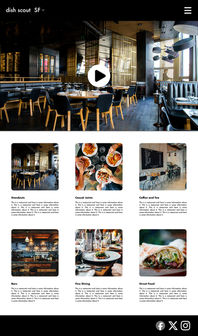
I started this project by sketching wireframes on paper for each page of the website, and I subsequently brought those designs into Figma to create mockups for each page. I opted for a black-and-white color scheme to emphasize the content and allow the images to take center stage. I relied solely on the typeface Futura PT in the mockups for a similar reason, as I found it a very neutral choice. However, after further deliberation I decided the final website should have more character in the typography and opted to use Lektorat Display and Portada by TypeTogether. Lektorat was extremely versatile for eye-catching headlines and subheads, while Portada added texture to the long articles while remaining extremely readable. NOTE: I also changed the name of the website after finishing the mockups.

Mobile Site + Solution
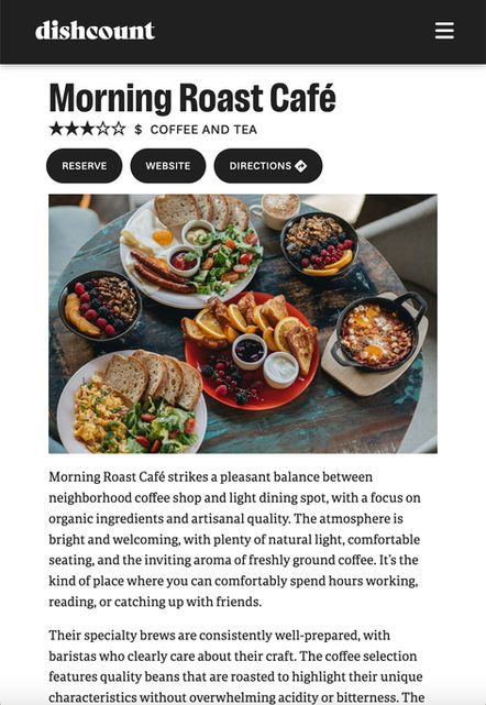
After finishing the mockups for the desktop website, I created them for the mobile version. The design is largely the same on mobile, only adapted to a single column layout.
Upon completing the mockups, I began coding the website in HTML/CSS. I used the Figma mockups as a reference, but ventured away whenever a stronger visual solution presented itself.
To clarify the user experience, I restructured some information within cards which change color when hovered over to show they are clickable. I also modified the color scheme from pure black-and-white to a very light and a very dark grey in order to reduce eye strain. When building the CSS classes, I adjusted the layout and type settings to refine the responsive behavior of the site and ensure the design worked at every screen size.
Dishcount’s final design maintains a striking, minimalist layout to ensure that reviews are the focal point, with intuitive navigation to allow users to browse effortlessly. The result is a sleek, functional website that delivers information clearly and succinctly.


