

Process
The goal was to craft a visually cohesive magazine that brings a lively, youthful energy, while still appealing to a broad audience. The design needed to balance a sense of fun with nuanced and detailed organization.
Typography/Grid
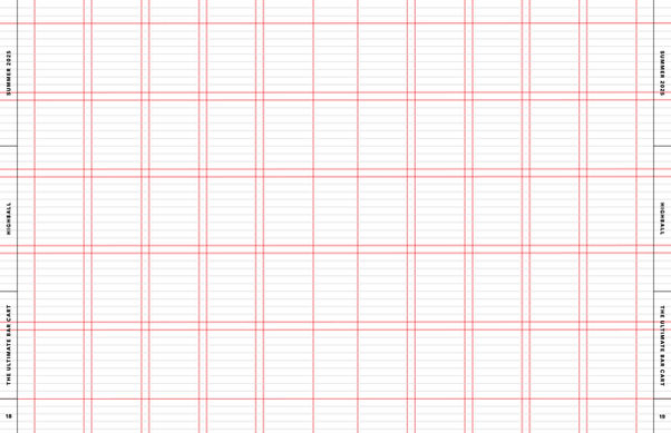
I designed the inner spreads of the magazine using a 5x5 modular grid, with 14pt horizontal subdivisions chosen according to the leading of the body text. According to the particular spread, I sometimes treated the layout as a column grid, ignoring the horizontal gutters for greater flexibility. However, I always respected the 14pt subdivisions and aligned all text to the baseline grid. A rectangular panel on the outer edge of each page provides the reader with necessary information, including the page number and article/section name.
In the interest of maintaining visual consistency, I relied primarily on a single typeface family, Adelle and its sans-serif counterpart Adelle Sans for all text within the magazine. My typographic hierarchy used sizes that were determined by the golden ratio, with larger text styles also receiving a heavier font weight. An additional geometric typeface, Dunbar, was used for the largest sizes of display text.

Cover
I designed the covers using a 7x10 modular grid with 14pt horizontal subdivisions and created four variants for each of the four seasonal issues. Each of these designs contains one large image which bleeds off three sides of the page. The image moves according to the season, with the text similarly adjusting according to the placement of the image. This approach yields enough variation to keep each issue interesting while maintaining visual consistency. The color of each issue varies according to the cover image, with text colors matching the image to create an analogous color scheme. Therefore, images must be chosen which prominently feature a single color. The masthead uses the typeface RL Aqva, which brings a trendy vibe with a hint of 70s throwback, while the remaining text uses Adelle Sans (the main text face for the inner spreads). A small sneak-peak of the inner contents “scrolls” across the page, cutting off on the right hand side. A full contents page appears within the inner spreads of the magazine.


