

Process
Fleet needed a playful, modern visual identity to emphasize convenience and usability while differentiating it from similar brands. Marketed as a practical, eco-friendly alternative to owning a car in a city, the brand targets a young (20-40), low-income demographic. The app is unique in offering 4 vehicle options (cars, bikes, scooters, and skateboards), so this was a point to accentuate in the design. The identity also needed to translate well across both physical and digital media, given the brand’s presence in both these settings.
Logo Sketches
I experimented with different methods of communicating the brand ideals by hand-sketching on paper to generate potential logo directions, and the strongest ideas were subsequently brought into Illustrator to develop further iterations.
The early sketches vary widely, each prioritizing a different aspect of the brand and providing a different conceptual approach. Some are pure logotype, some abstract geometric designs, and some representational icons (all based on animals).
The logotype variants proved too clunky, the representational icons too complex, and the geometric designs lacking in their emotive capacity. The final design blended two of these conceptual approaches, utilizing a geometric design reminiscent of a bird in flight.

Iteration
Once deciding on the arrow icon, I auditioned several typefaces and relationships between type and icon. Most of the typefaces were too futuristic and lacked the approachableness this brand needed, but I eventually settled on Polymath–a geometric typeface with the perfect blend of futuristic “tech” energy and friendliness. It also contains excellent glyph alternates which I used for four of the five letters. Attempts to overlap type and logo were intriguing, but introduced unnecessary complexity and yielded logistical issues with contrast and scalability.
Still working to finalize the exact arrangement of type and icon, I began incorporating color to observe how this would influence the logo. In the interest of ensuring sufficient contrast and legibility at small scale, I gravitated towards placing the icon within a circle and the brand name alongside. I was nearly decided on this approach, but held some reservations about using one prominent color in the logo.
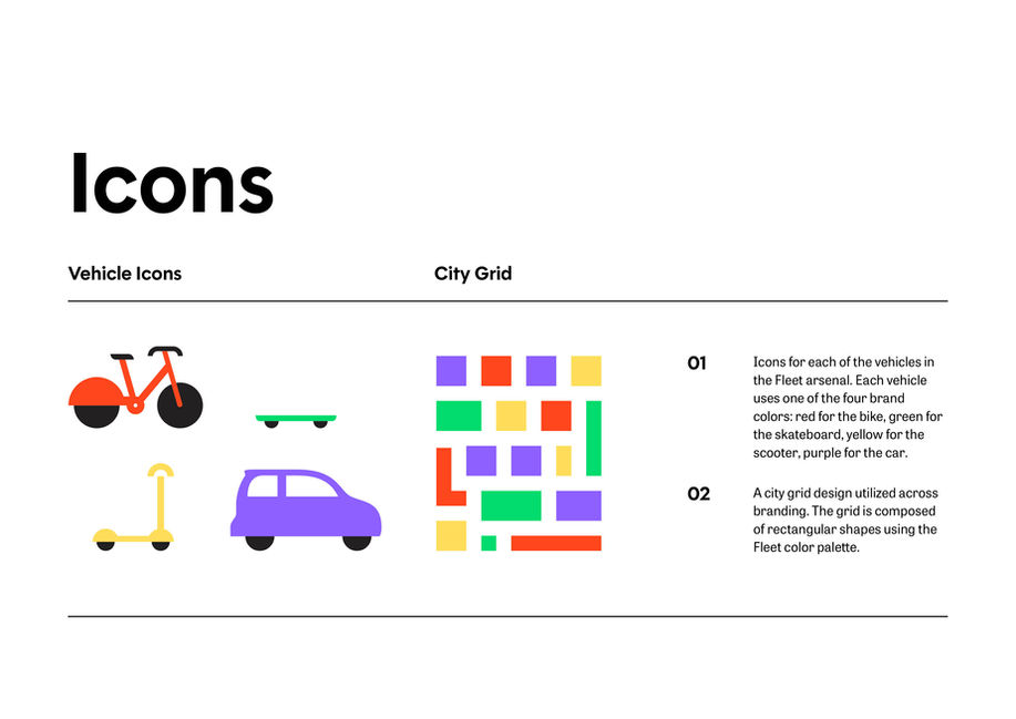
In an effort to differentiate Fleet clearly from its competitors, I chose four separate colors to distinguish between the four vehicles. This palette clarified the business while conveying a sense of vibrant energy. In response, I eliminated color from the logo entirely to allow other branding elements to communicate the color palette. I simplified the logo to pure black and white and, discovering that the black circle was too visually heavy, I positioned the arrow icon alongside the type in both a vertical and horizontal arrangement. In the final variations, I also eliminated the bottom-left stroke from the arrow icon which yielded a satisfying asymmetry, reinforcing the bird connection and reducing to idea to its simplest form.

Color and Icons
After completing the logo, I developed vector elements to flesh out the brand’s visual language. As part of this process, I experimented with color and refined the palette, opting for a tetradic color scheme of red, yellow, green, and purple. I initially created this palette in an RGB color space, provisionally selecting a neon green and an iridescent blue-purple which could not be reproduced in either CYMK or Pantone. I then selected the nearest Pantone equivalents and adjusted my RGB colors to produce a closer match. Finally, I found the nearest CMYK matches to the Pantone colors.
My explorations with vector patterns produced two results: a grid design evoking a top-down view of a city map, and a collection of vector icons for each of the four Fleet vehicles. I refined these initial sketches and swapped the colors for the bike and scooter to differentiate Fleet from a competitor renting red scooters.

Typography
The typeface Polymath proved exceptionally versatile for this project. After utilizing it for the logo, I selected Polymath as the primary typeface for Fleet’s branding. A secondary option, Tablet Gothic, was chosen solely for extended copy, a setting where Polymath’s geometric design would become slightly tedious to read, especially in print.
Solution
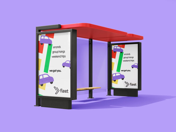
The result of this process was a fresh, vibrant identity which clearly separates Fleet from its competitors and establishes a playful, approachable brand image to appeal to the target demographic. Branding materials incorporate the core brand assets with a generous use of white space, striking the right balance of bold energy and calm.


